
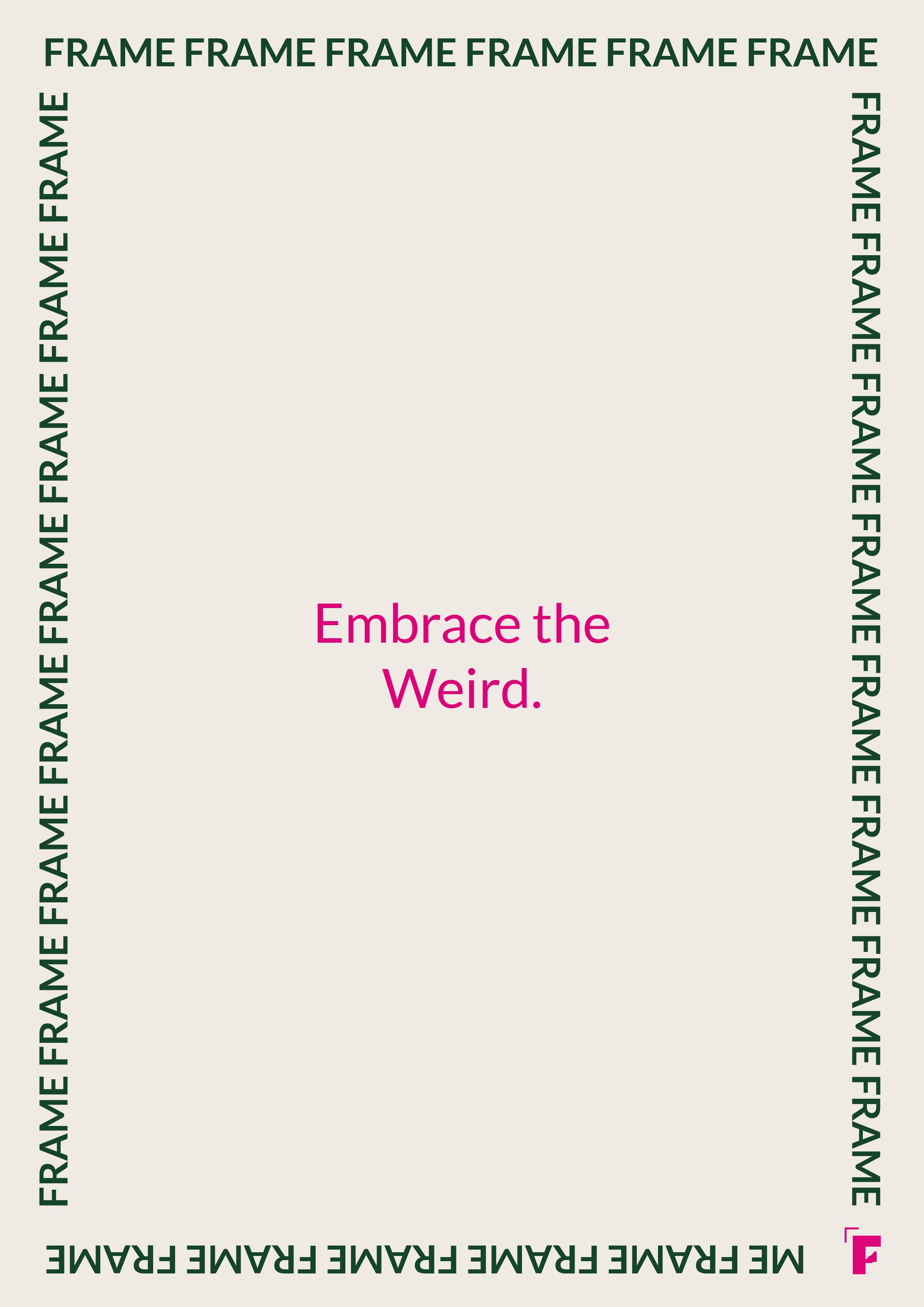
The aim of the brief was to rebrand the medical "Mütter Museum" based in Philadelphia (USA). Considering the amount of knowledge gathered through the centuries and the explicit but authentic showcase of specimens and other collections, the concept created was to "embrace the weirdness of our body". This includes not only educating the audience, but also entertaining, inspiring, intriguing, reflecting and most of all reminding what it is like, how beautiful, fascinating and enjoyable it is to be human.
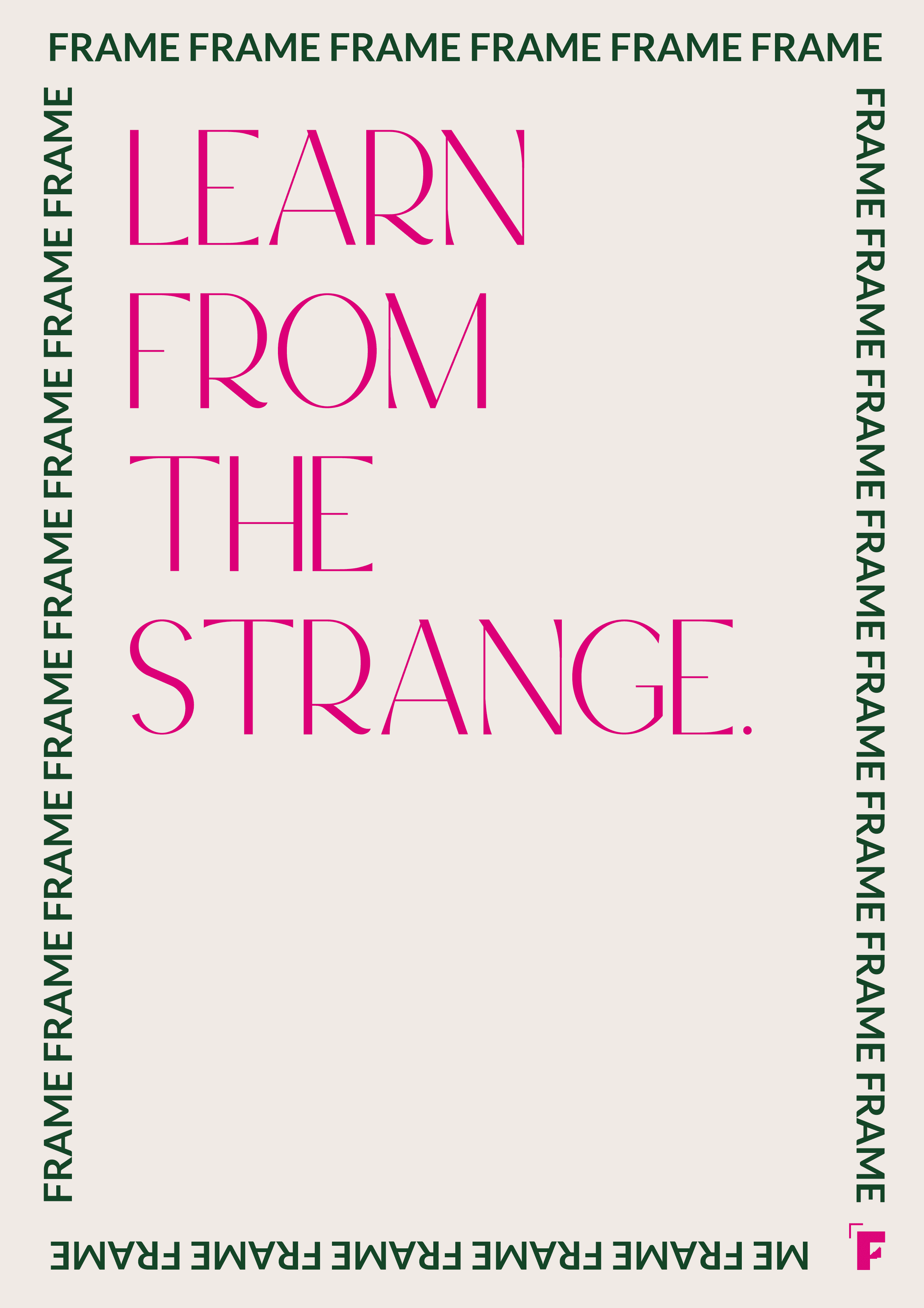
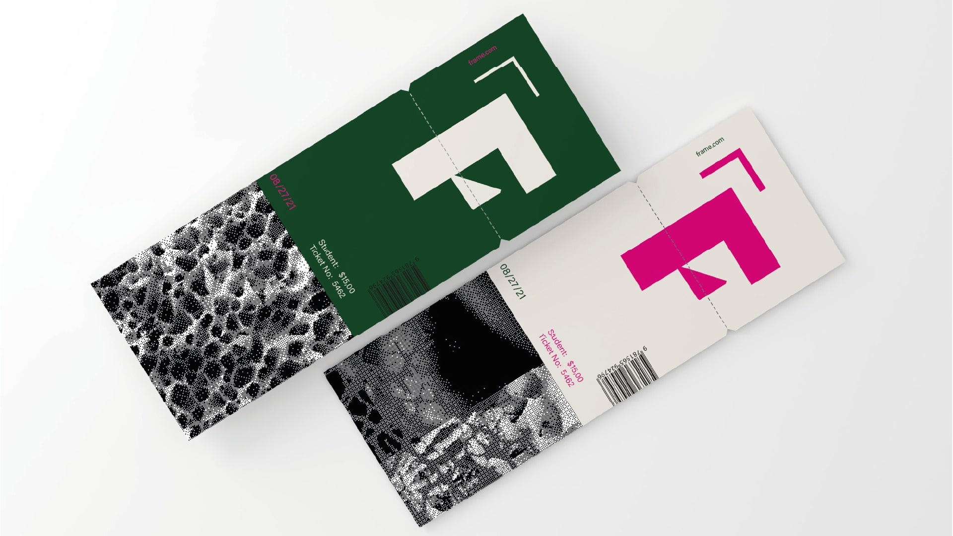
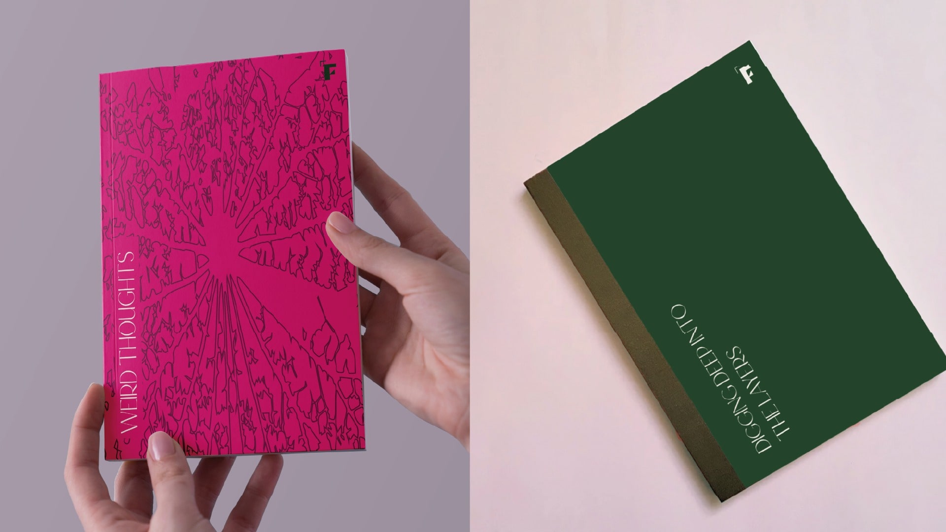
The name "Frame" was chosen to indicate not only the base of the human body, but also the structure that comes with it. The typeface is self made and it is characterised by both pointy and soft rounded edges.
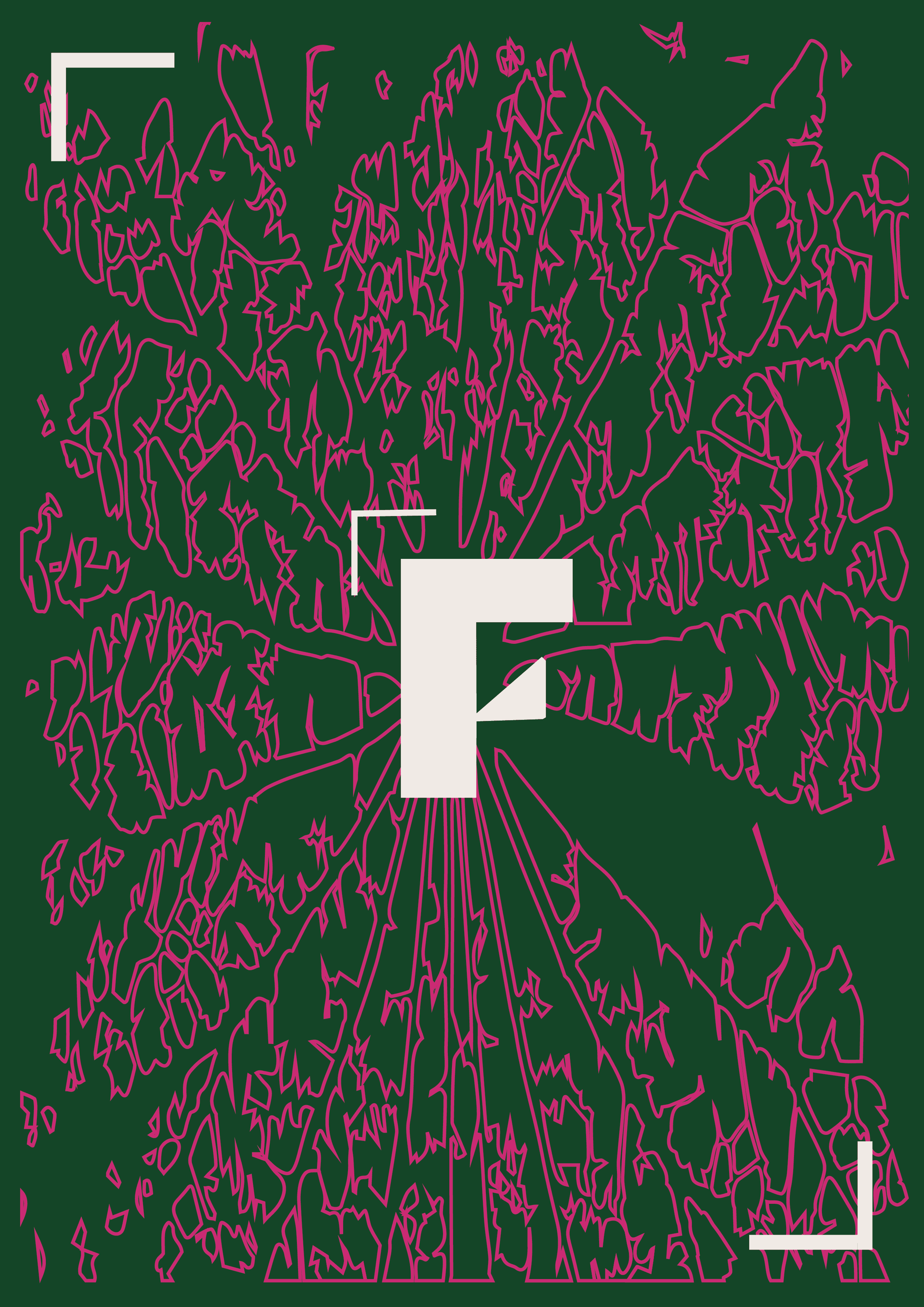
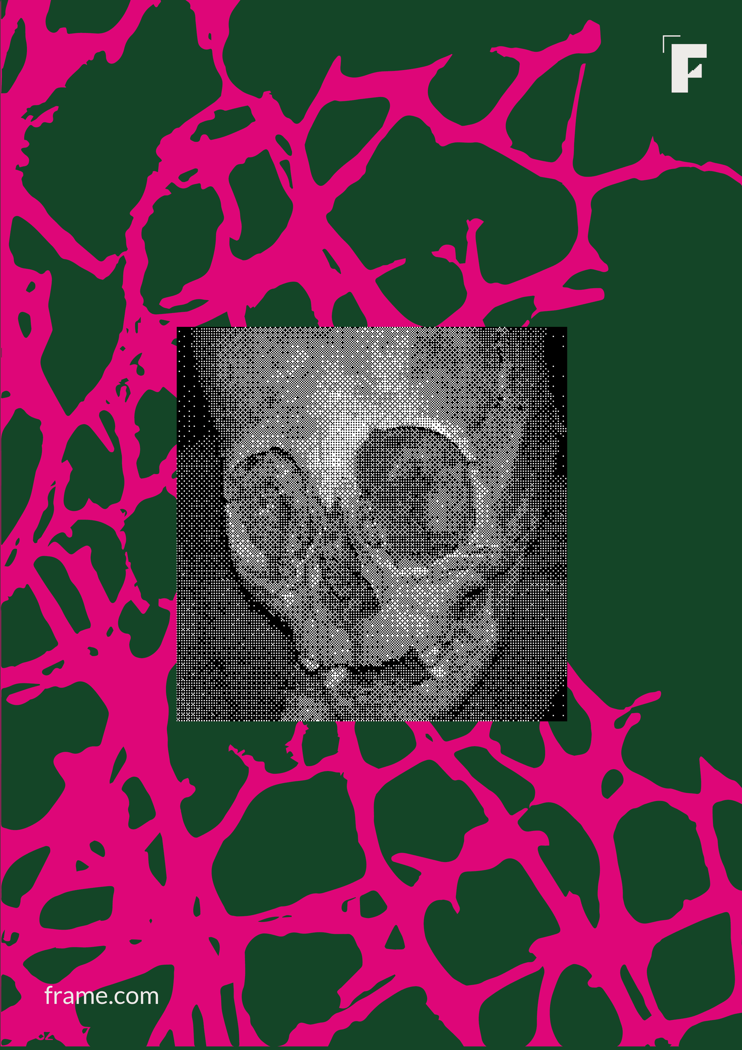
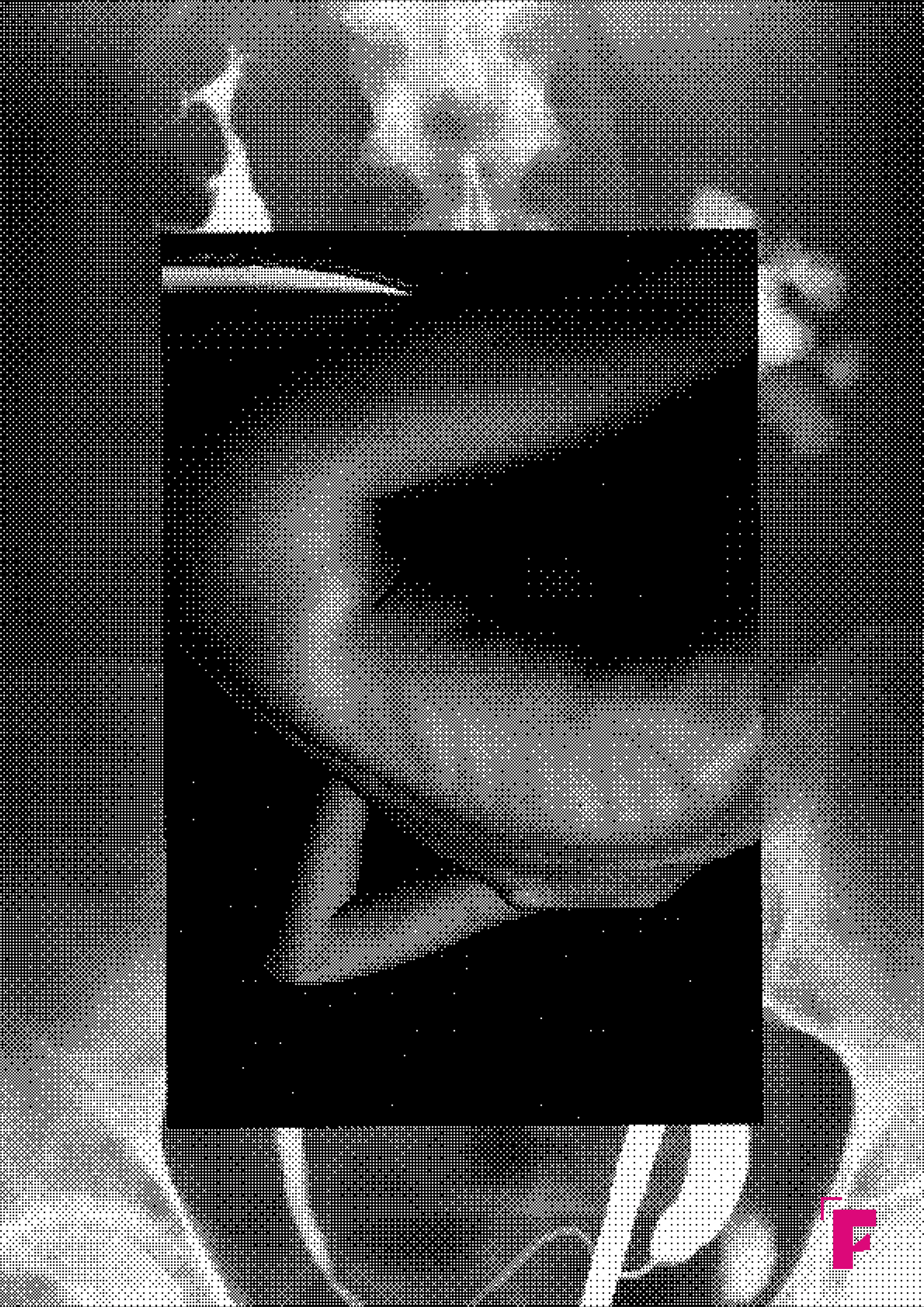
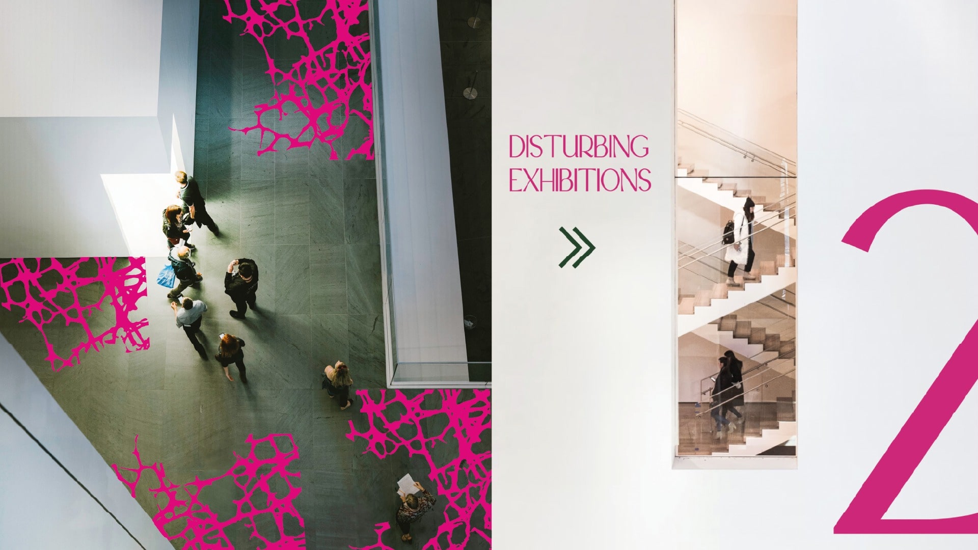
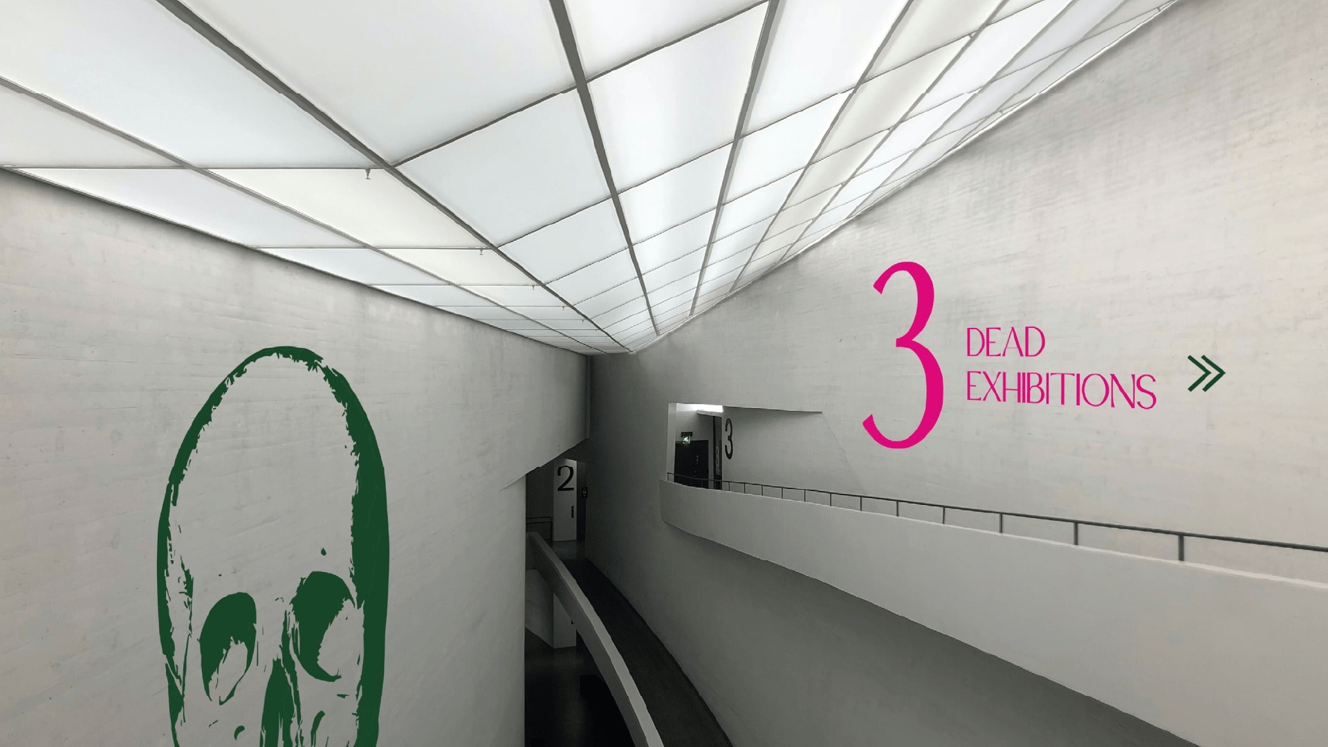
The image treatment includes the use of human anatomy and natural textures.
The use of the bitmap effect displays how something is truly defined, which
brings us back to the authenticity of the museum's purpose.
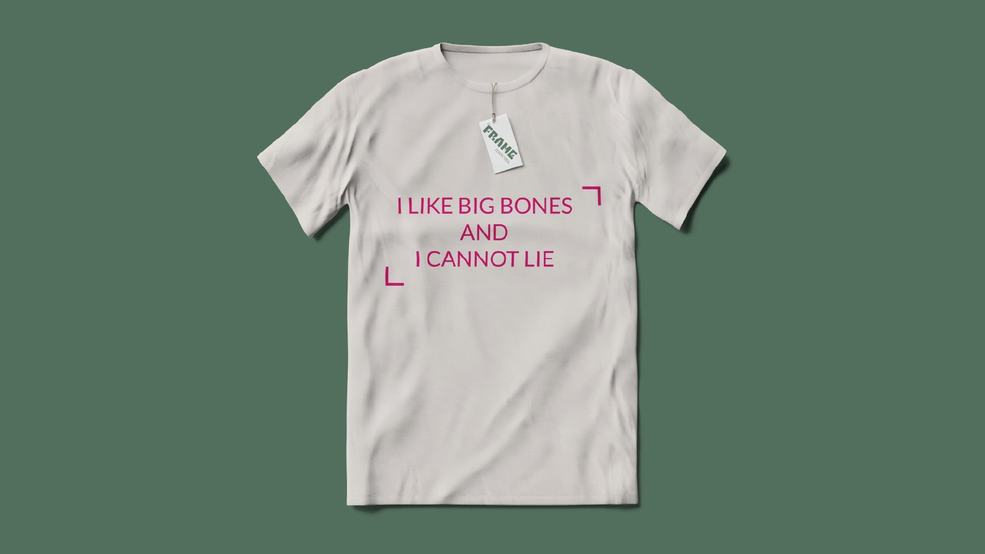
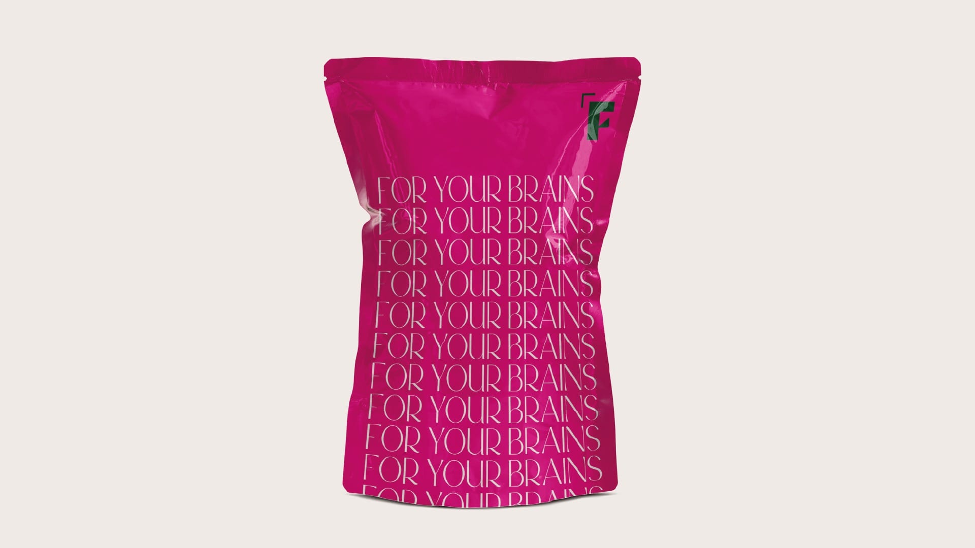
Natural colours such as green and beige were used, but in combination with a
strong pop up pink that projects positivity and inspires warm and comforting feelings.
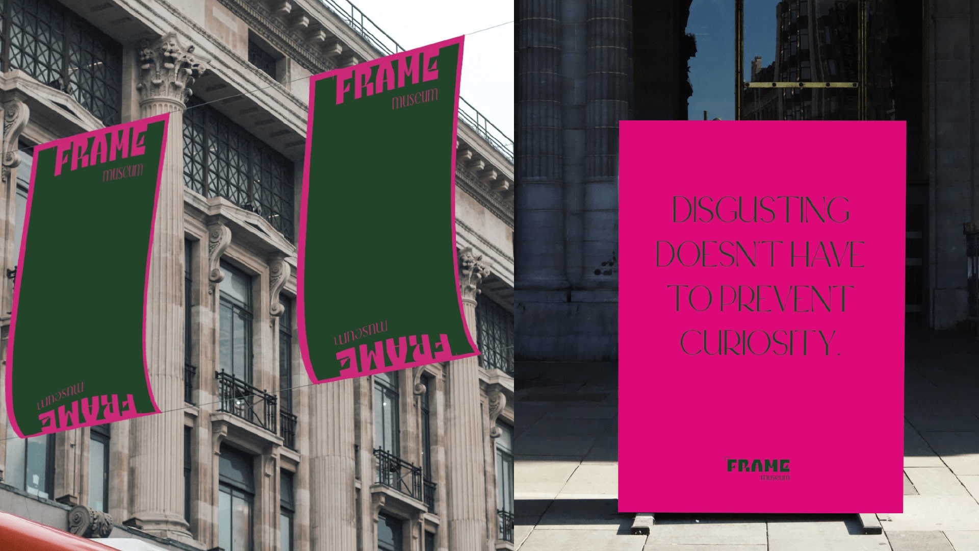
Embrace The Weirdness.

© dicaroo2022